“Character Building”, both figurative and literal. On one hand we have the illustrator going through their own creative mental process (welllll… i do, not everyone is as angst-prone as i am i suspect), but also, from the art standpoint it’s a lot like Dr. Frankenstein (a bit of this, a bit of that, stitch it all together, add a lightening strike) with some Darwinian evolution thrown in. It starts as a scribble… but it grows and evolves, and eventually winds up becoming a real, finished character. “Fur & Feathers” had several featured characters that needed to be developed, mostly animals (something of my speciality), but also a little girl, named Sophia.
The minute i read the story i wanted Sophia to look like my daughter. Let’s face it, there is something of an autobiographical streak in all creative work. I suspect, when she wrote it, Janet Halfmann was picturing someone from her own life – a relative perhaps, or maybe herself as a little girl. The wonderful thing about “art” – any art – is that it allows the creator (and the audience too of course) to transport themselves. To be part of the action or the experience. The writer does it a bit more metaphorically, with words which by their very nature are more abstract and ethereal – interpretive. The illustrator gets to give it a more concrete, tangible form . Such is the give and take, the ebb and flow, the yin and yang, the I-have-the-pencil-and-I-know-how-to-use-it nature of the visual arts. And it does wind up kind of excluding the author. This came up at a book talk recently, when a writer said that she preferred to self-publish – so she could work directly with the illustrator and have a stronger say in how her story, her characters, were portrayed. Fair point. That is certainly a legitimate concern and all i can liken it to is when someone writes a screenplay and sells it to a movie studio. Unless that person is going to produce and direct the movie themselves (as well as finance the dream cast, build the sets, sew the costumes, and cater lunch) they kind of have have to trust the people who do that for a living. When it comes to stories, the writer has to trust the publisher to pick the best illustrator for the project. An illustrator whose skill, style, and technique the publisher feels will best compliment the author’s words and bring the story to life. Maybe even take it to places the author never considered.
In the case of “Fur & Feathers” i think Sylvan Dell went out on a limb, just a little bit, with me because this story was something of a departure from my other books. There were animals to be sure, but there was also a human character that had to be sustained throughout 13 full-page spreads. And the setting was all interior, the little girl’s room, as opposed to the more natural settings i’d illustrated in the past. Now i do draw people, and have many in my portfolio, a lot of them children, but a one-off, spot illustration is different from a sustained character in a series of drawings. I knew i could do it (oh, okay… i thought i could do it) and i gave Sylvan Dell several samples of my children sketches, per their request, to demonstrate i was up for the challenge, but it was still an incredible vote of confidence and faith on their part to let me run with the story.
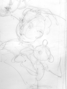
But all that artist ego-bolstering aside, the fact remained that in terms of “Fur & Feathers” i really wanted Sophia to look like my daughter… my quintessential Muse… but my “little girl” had long since grown up and was no longer the age of the child in the story. In fact, all the kids in my neighborhood, who i had long turned to for children poses, had outgrown the age of the child in the story. I had photo albums, and lots of other kid references, and of course my imagination, so for the initial first stab at the pencil sketches i just kind of “roughed” in the pose. More of a place saving generic kid figure, to give a general idea of what the eventual finished character should be doing, per the manuscript – but without all the features and details that would make Sophia “real”. At this stage it really didn’t have to look specifically like my daughter, or “anyone” for that matter … it just had to give the basic idea of what the character was going to be doing in the picture. All the pictures. Details would come later.
It does help to have an actual reference. A real person or a photo to look at. Again, i am just speaking for myself, but i am reminded of something one of my professors said in college. It was a painting class, and i was doing a still life of bottles and twigs, but i was making it up entirely in my head. My professor came around, and noting the lack of real, physical items suggested i go out and actually gather the objects i was trying to paint. He said the human mind was not nearly creative enough (and i’m paraphrasing here, because it’s been ages since the class) to recreate all the nuances and details, effects and shadows, found in nature. In rather stereotypic cocky college-kid fashion i thought my professor was bonkers. My imagination was more than creative enough, thank you very much… but, big surprise, my professor turned out to be right. It really does make the job so much easier when you have good references.
Of course that being said, i need to confess i never did have a specific consistent reference model for Sophia. She was kind of an amalgam of pictures of my daughter, other kid tear sheet references, and photos of the young girl who lived down the street (who was the right age and very happy to pose for me so i could get Sophia’s body correct). Since i was going for a more whimsical style i felt i had a degree of leeway with Sophia’s over-all appearance, and just kept fine-tuning the pencil sketches using what references i had available to work with. In retrospect i kind of made that part of the job harder on myself than was necessary because i agonized and second guessed myself the entire time i was drawing Sophia – worrying she didn’t look consistent from one illustration to the next.
But even if i the perfect child model had been readily available, and at my beck and call whenever i needed a quick pose, it was still up to me to decide exactly WHAT this fictional child would look like. Long hair or short. Pig-tails or curls. Black hair or brown. Freckles? Glasses? So many decisions. I did all the preliminary rough sketches giving Sophia a kind of short-ish bob hair style (a bit mussed since she’d been sleeping) and that just became her look. It wasn’t a particularly conscious decision beyond the fact that i didn’t want her to look too “girly” so the book could appeal to boys as well as girls. I read somewhere that girls generally have no problem reading books with boy protagonist, but boys tend to shy away from books with girls as the leading character, so Sophia needed to be broad-based enough appeal to all readers. And heck – it didn’t hurt that she looked a lot like my daughter did at that age (what are the odds!?).
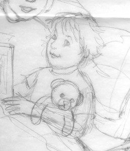
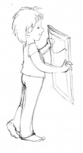
And besides being responsible for the hair and make-up (so to speak) the illustrator also has to serve as the costume designer. If the clothing details are not described in the manuscript it is up to the illustrator to figure out what the character needs to wear. Obviously period stories need time period appropriate attire, modern stories – particularly those that take place predominantly in a child’s dream – give you a lot more flexibility. Since F&F starts out with Sophia in bed, and the story continues through the rest of the night, it was pretty obvious that pajamas would be the clothing of choice, but that still offered a broad range of options. Night gowns, footie PJs, over-sized T-shirts, gym shorts and a tank top – all sorts of possibilities were considered and discarded. Though actually, in the case of F&F, i didn’t consider and discard that many options. I had a pretty clear idea of what Sophia would sleep in right from the start. Being a current, modern, story (as opposed to a period piece) and based on what my own daughter used to wear (and what i like to lounge around in) i immediately thought of traditional pajama bottom pants and a related short-sleeved T-shirt ensemble. I confirmed this couturial choice with my Sophia/Jesse model down the street but i must confess i was also influenced by the pajamas that the 10th Doctor wore in the “Doctor Who” episode, “The Christmas Invasion” and wanted to give a little visual nod in that direction. That was probably one of the first, of what would wind up being several, little personal pictorial inclusions (not counting Sophia’s whole appearance to begin with) throughout the book, but those will all be explained and examined in their due course.
Sophia in her pajamas
For the time being Sophia was more or less figured out. Now it was time to turn my attention to the featured animal characters…..
Your post is nice! Keep up the beautiful idea!