Fur & Feathers: Chapter 8 – Hue & Cry, Going to Color

September 19th, 2010

While the actual definition of the phrase “hue and cry” refers to a public clamor or stir i mean it quite literally.  HUE, “as in a particular gradation of color“, often makes me CRY!  I have something of a love/hate relationship with color in that… i really don’t know what i’m doing when it comes to working with it.  Pretty ironic given what i do for a living, and if one has looked at the various images in my portfolio and books it might sound a bit disingenuous (given all the colorful stuff in there), but really – if things look nice it has a lot more to do with luck or accident than any real grasp of the concept on my part.   I’m truly much more comfortable with a trusty #2 pencil (Paper-Mate Mirado Black Warriors are the best!!).

That being said, i should clarify that i am comfortable coloring specific items or objects – like animals or plants.  If something has to look like a particular thing, or match an exact reference, i’m your gal!  That kind of coloring is fun and there is nothing i enjoy more than a faux finish or trompe l’oeil image.  Where i get into trouble is doing detailed backgrounds or coming up with mood and shadow and tone.  In the case of “Fur & Feathers”, however, i must admit my chapter title is misleading in that i don’t think i cried at all during the process (i just wanted to use the phrase).  That’s not to say there wasn’t the occasional emotional upheaval (i am a “temperamental artist” after all)  only that coloring F&F actually didn’t bring the usual angst.

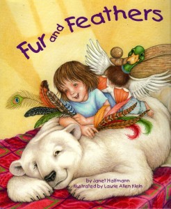
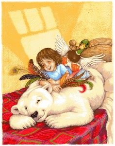
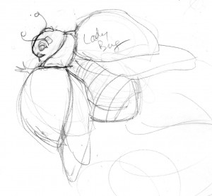
For me, choosing the color palette is always the most difficult part.  NOTE: I know we’ve been here before with this image, but i thought a bit of up-close detail might help explain the mental process.

F&F-Cvr(feathers)168

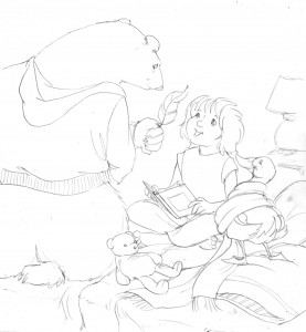
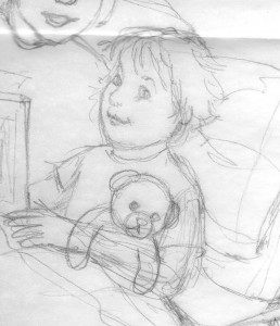
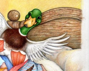
As mentioned earlier, the color of the animals and the individual feathers – all established in nature – was easy (and those feathers are all based on real natural patterns, by the way, with a few costume ones thrown in)  and i had already decided what i wanted Sophia’s pajamas to look like (a nod to the 10th Doctor from the “Christmas Invasion” episode of Doctor Who) the rest was something of a blank.  I really had no idea what the background – specifically, Sophia’s room – should look like, or what color it should be.

I did know i didn’t want her room to be stereotypically pink and girly so i looked through all sorts of home decorating magazines and books to get inspiration and eventually came across a picture of a room with lovely warm yellow walls and this great red and green and pink bedspread.  Feminine without being fussy it fit my needs perfectly – i just changed the headboard and spread.

F&F-Cvr(headboard)169

As i recall, the headboard in the magazine photo was a white iron thing, a little too flimsy and – to be perfectly honest – complicated to reproduce multiple times.  A nice wood headboard not only added a bit of a masculine touch (for boys in the audience) but creating wood finishes is quick and easy, and when you’re coloring 13  17″ x 10″ spreads you grab some ease wherever you can find it.

Of course whatever time i saved coloring a solid wood headboard was off-set by the elaborate bedspread i ultimately designed.

F&F-Cvr(bedspread)167

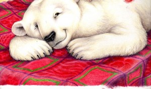
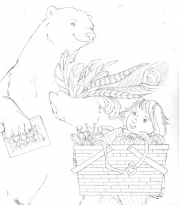
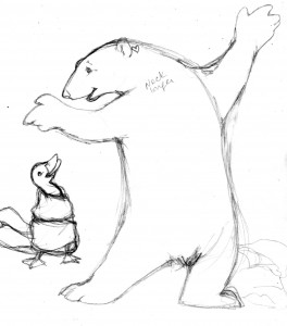
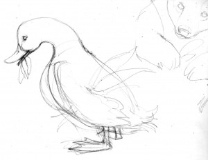
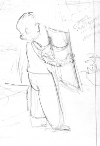
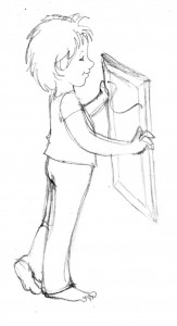
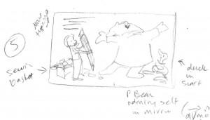
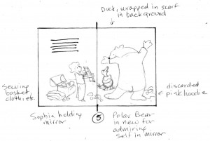
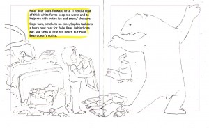
The spread in the reference photo had a flower pattern and while it was very subtle i didn’t want a floral image.  Instead i decided to go with alternating squares of animal and feather patterns as little visual play on the fur and feathers of the title.  Of course once you commit to a pattern you have to reproduce it every time that particular image comes up throughout the book, but i often use a sort of assembly-line approach that serves me well  for those circumstances.  When an image repeats from page to page i tend to go through and just color that specific image each time it occurs – first all the bedspreads, then all the times Sophia showed up, then all the polar bears and ducks, then the sewing basket, etc.  Once all the major foreground items and characters are done i go back and color in the background.

F&F-Cvr(wall)166

Because i had to leave room for the title there needed to be a clear space at the top of the page but i wanted to convey the idea of a wall in the background, as well as add a little textural interest.  I thought of all the neat patterns that can appear on a bedroom wall from ambient moonlight or street lamp reflections and thought that would break up the area nicely.  That use of geometric shapes could then be applied to the background spaces throughout the rest of the illustrations.  Decisions made for the cover were then carried on throughout the rest of the book.

Color palette decided, and background issues resolved,  it was now time to go to finished art.

Gettin’ Back Into the Blog w/ Up-Coming Fur & Feathers Events

September 2nd, 2010

It has been far, far too long since i last wrote anything.  It certainly has not been from lack of subject matter or interest… i just got busy.  Crazy busy!  Insanely chained-to-my-drawing-table- every-day busy.  Somehow lost the whole summer busy.  That busy.

Basically i got swallowed up doing the illustrations for the planet book (that will come out Spring 2011 – and will soon be getting it’s own blog series) and that sucked up all my creative energy.  By the time i’d finished coloring planets and starry night backgrounds – plus an additional wealth of guest appearance background characters from history, science, math and the arts – all day (every day, for the past 3 months) i had no energy left for thoughtful literary musing, i just wanted to flop in front of the television.

Yes, i do that.  I’d love to say i went for long, introspective walks along the beach, or sat absorbed in classic literature (those quaint and curious volumes of forgotten lore we’ve all heard so much about), but no… i’d pour myself a glass of wine, pull out the chips ands cheese (or other junk food favorite) and watch repeats of all the alphabet shows: CSI, NCIS, SVU until bed.  That was all my poor battered attention span could handle. But all that is now behind me!

Well, okay, that’s an over-statement; the planet book illustrations are indeed behind me…  but all that other stuff is still very much part of my routine, and i have always had the attention span of a flea – so who am i trying to kid?  Let’s just say, now that the planet book illustrations are done, shipped,  and going thru the lengthy alchemy of becoming a finished published book it is time to return to the already finished published book that absorbed this blog for so many entries:  Fur and Feathers!

There are still a few blog chapters left to post describing the illustration journey that was/is  F&F, but before i resume that narrative i need to cleanse the mental palate (so to speak) and thought the best, easiest way was to list a few up-coming “Fur and Feathers” Book Signing/Promotional Events (descriptions of which will, undoubtedly, eventually become fodder for additional F&F chapters).  So…..

F&F book cover980

First Friday (St. Augustine, FL): Book Signing at Simple Gestures.  Friday, Sept. 3.   5 – 9

Florida Heritage Book Festival (St. Augustine, FL):  Children’s Program at the Flagler College, Ringhaver Student Center.  Saturday, Sept. 25.  1 – 2  [NOTE:  My program runs from 1 to 2, but i’ll be there all day, signing books and schmoozing at the Nature Nook table].

Maryville College Homecoming (Maryville, TN):  Little Scotties Activity Area – storytelling at the Maryville College campus.  Saturday, Oct. 23.  10 – 1

Micanopy Fall Festival (Micanopy, FL):  Book signing at the Nature Nook booth.  Saturday, Oct. 30.  Time to be announced (but i’ll probably be there most of the day).

Ocali Country Days (Ocala, FL):  Book signing at the Nature Nook booth.  Saturday, Oct. 30.  Time to be announced.

Right Whale Festival (Jacksonville Beach, FL):  Book signing at the Nature Nook booth.  Saturday, Nov. 20.  Time – again – to be announced.

Now let’s see what new stories i can generate!!!

Fur & Feathers: Chapter 7 – Cover Stories

April 24th, 2010

So the pencil roughs for Fur & Feathers were finished (and shipped by the due date of July 20) and now it was time to turn my attention to the cover, which was due by August 15 (and when i say “due” i mean – finished color by August 15 – not just rough pencil ideas).  Sylvan Dell needs cover art before the interior illustrations for marketing purposes, but they like to have the illustrator start thinking through the entire book first, so that’s why they ask for the rough sketches before the cover.  Presumedly, while you’re busy working on the individual pages, cover ideas are already starting to gel.  But not necessarily.

Some book covers just come easier than others but usually (at least in my case) the process takes a little more time and creative energy, with the added complication (again for me, as i described in a letter to a friend) “the cover has to be colored and finished before i’ve even actually finalized the look and style of the book illustrations.  If i put the main character on the cover that character has to look the same thruout – meaning not only do i have to design a cover i also have to fully realize whatever character or characterS are shown.  Plus nail down the color technique (i can’t do the cover in paint with a realistic look and then decide the illustrations should be in cut-paper abstract collage for example).”  [NOTE:  As that excerpt suggests, many times my rough sketches are VERY rough, and i polish the images up before i actually go to color]

Also F&F was a bit more complicated in that i really couldn’t come up with an easy,  explain-the-story-in-one-image-without-giving-away-any-surprises idea.  The story itself is really kind of hard to describe without pretty much telling the whole thing.  “Because of a wind storm, a little girl has trouble falling asleep so she and her mother count animals, and in her dreams the animals and the wind get all smooshed together and the storm winds up blowing all the animal’s fur and feathers and coverings off, so the little girl has to fashion new ones using materials from her grandmother’s sewing box – after discarding the idea of using her own clothes.

I thought of using the swirly vortex image, but i wanted that to be a surprise.  Nor did i want to give away the cute whimsy of Sophia dressing the animals in her own clothes.  There was also the dilemma of there being 8 featured animals besides the little girl which could get kind of cumbersome for one picture.  You do have to leave some subjects for the interior after all.  In the end i decided to concentrate on Sophia and the first two animals met in the story – the polar bear and the duck.

Rough cover idea - 1

Rough cover idea - 1

The whole story takes place in Sophia’s bedroom, and there is something just kind of funny about animal’s butts (what can i say), so that is what prompted the first idea.  I should also note that while i had the p bear and duck “dressed” in Sophia’s clothes i had every intention of coloring them as if they still had their original fur and feathers (to avoid the whole “naked animal” dilemma of an earlier chapter).

Rough cover idea - 2

Rough cover idea - 2

The polar bear just naturally lent himself to posing as a bear rug, so that inspired the second idea.  With the addition of the quintessential feather – a peacock plume.

Rough cover idea - 3

Rough cover idea - 3

I like extreme close-ups, and the idea of this huge polar bear beside the little girl struck me as funny. It also conveyed a bit of mystery about the nature of the animals and what they had to do with the story (and i could introduce the grandmother’s HUGE sewing basket).

Rough cover idea - 4

Rough cover idea - 4

Rough idea #4 is obviously a variation on idea #3, just in case the image of a headless bear was unnerving or struck anyone as odd.  He’s carrying the book i kind of invented (to explain why the little girl and her mother were counting animals) mostly to give him something to do with his paw.

Rough cover idea - 5

Rough cover idea - 5

And – finally – i kind of went full circle and did a variation of the first idea, having Sophia face the reader (thinking that might make it feel more engaging, as opposed to looking at everyone’s back).

I sent everything off to Sylvan Dell and awaited their thoughts and feedback:                                  “Sketch 1 – people didn’t like having the backs to us. Omitted as cover option… but several staff commented on what a great piece of art it would be for the back of the book.   Sketch 2 – Lee liked this one best but wondered about the rug.  But I don’t know what else you could use for them to be on.   Sketch 3 – This was another favorite and one thing that the staff kept saying that they liked were the variety of feathers… That led to a conversation about what if there were more feathers in #2.   Sketch 4 [NOTE: Idea #5 isn’t mentioned because it was sent later] – Like better than one for sure for cover but let’s see #2 with more feathers.

Which prompted …

Revised cover idea -2 (with more feathers - polar bear)

Revised cover idea -2 (with more feathers - polar bear)

And…

Revised cover idea #2 (with more feathers - Sophia)

Revised cover idea #2 (with more feathers - Sophia)

And in answer to the question of what to do about the rug, in the original sketch proposal, i decided to move everyone to the bed.

August 7 i got the news –  “I think we should go with this one.

Fur & Feathers cover art

Fur & Feathers cover art

Of course that’s how it looked when i finished it, obviously i still had to color everything in.  But that – and the whole coloring process in general – will come in the next chapter.

Happy Birthday, Nana

April 8th, 2010

Today – April 8 – happens to be my grandmother’s birthday.  She went by many names: Lillian, Sis, Mother.  My brother and i called her Nana.  Or “My Nana” as i often have to say now, because my mother inherited the title when my daughter was born so when reminiscing about my childhood with Jess, i have to make the distinction to avoid confusion.  Anyway, at 4 this morning i happened to wake up and suddenly got the whim to post a detail of a drawing i had done of my Nana on my fb wall (yeah, i got sucked into that vortex – but that can be another blog) to celebrate her birthday and her memory.   The beauty of being an artist is – you so often have the odd piece of art just lying around to be used at such random, impulsive insomniatic moments.  And – to be honest – i also thought i could make this a fairly short blog.  We’ll see.

The illustration had been done for the Christmas card the year our daughter was born, really as something of a combination birth announcement/holiday greeting, and originally was just going to feature our new baby.

Thumbnail of Great Granddaughter Card

Thumbnail of Great Granddaughter Card

To that end i did a series of little sketches trying to work out the best angle of our little angel.  The quintessential, five-month-old, new baby pose.  The angel angle if you will.  The smiley one – with her tongue sticking out in pure baby glee – was the obvious choice.

Baby Poses

Baby Poses

I don’t recall now exactly what prompted me to include the great grandmothers in the picture (as opposed to the more obvious new parents or immediate grandmothers) but such is the nature of creative whimsy.  I think it was simply because Bob had grown up with his “Nonnie” and i had grown up with my “Nana” AND we just so happened to have these great photos of the two women – as flappers.  That was simply a heritage and a legacy too wonderful to pass up.

Pencil Rough of "The Great Granddaughter"

Pencil Rough of "The Great Granddaughter"

And, of course, i managed to come up with an appropriate story ~

Some of my strongest childhood memories are of Christmas at Mammy’s house.  She was my great grandmother and her biscuit cookies were legendary.  Christmas is a time of magic and remembrances but unfortunately Jesse won’t have memories of her great grandmothers, and no one has ever been able to duplicate Mammy’s recipes.  She will, however, have the cherished photographs, the old letters and the sepia tinted stories of her parents and grandparents.  And I know that Nana and Nonnie are sharing her Christmas.

The Great Granddaughter, Nana & Nonnie

The Great Granddaughter, Nana & Nonnie

So to Lillian, Sis, Mother and Nana… Happy Birthday!

Meet the Planets: Giant Characters, Teeny Tiny Thumbnail Sketches

April 4th, 2010

Okay, so the “best laid plans” as they say (tho why Mice and Men both have plans that often go awry still escapes me).  I fully intended to write about the “Meet the Planet” illustration process – AS I DID IT – but here i am, nearly finished with the pencil rough sketches and not a written word to be seen since the initial intro.  Actually i think this step was kind of addressed in an early chapter of “Fur and Feathers” – i always seem to be juggling numerous projects simultaneously so free time is at a premium and finding time to sit and write often difficult.  And, i’ll be honest, sometimes – after drawing all day – i really just don’t want to tax my brain any more with creative musing and the last thing i want to to do is try and wring out any more creative juices in the form of literary analysis.  However, things are zipping right along and i don’t want to get any farther behind.   So, by way of quick recap…

I got the new manuscript on February 11, with pencil roughs due April 9, and immediately ran off to the bookstore scooping up everything i could find on planets, astronomy, the universe, galaxies, and space.  I already have a fair number of reference things at home (Carl Sagan’s “Cosmos” – book and DVD, “Comet” and “Murmurs of Earth”, a Time/Life series on natural history and the universe, a stack of Kids Discover and Scientific America magazines, an eclectic Star Wars and Dr. Who collection) so after adding to the library coffers i simply spent the next several weeks reading and absorbing and musing.  I got so caught up in all the wonderful extraneous details and information in fact i kind of lost track of time and suddenly realized it was the first week of March and i had yet to put pencil to paper.  But my mind was at least full of possibilities!

Per a pattern that was established with the very first book i did for Sylvan Dell (“If A Dolphin Were A Fish”) i began with small thumbnail sketches of each page, to make sure SD was comfortable with the direction i intended to take.   This book is quite the departure from the nature-based animal books i’ve done in the past and the sky (or the cosmos) really was the limit in terms of stylistic direction.  This is the kind of project i just go crazed over – a seemingly simple little, self-contained topic that winds up embracing everything from history and literature, to invention and philosophy, to mythology  and art, to several branches of science and classical music.  And don’t even get me started on pop culture possibilities.

I finally started roughing out the thumbnail sketches the first Friday in March (3/ 5) and got into such a groove i finished them up that following Wednesday (3/10). The small rough drawings gave a pretty fair idea of what the finished full-size pages would/will ultimately look like, but there was so many other little details involved i wound up including a little explanatory note for each page.  And those, more than anything, best describe the process.

Per the attached note that accompanied the sketches:

Thumbnails: Pages 1 - 6

Thumbnails: Pages 1 - 6

*I’m using Stonehenge as a backdrop/stage for the “Competition”.  I wanted to bring the “History of Astronomy” element, and while there is some debate about what the standing stones mean, most people seem to agree they were erected to record certain celestial events and it’s instantly recognizable as such.  It’s something of an iconic monument (better known than the Chomsung Dae Observatory in Korea for example).

*I’m still developing the actual look/personalities of the planets – but i’m pretty much leaning toward keeping them actual “planets” (as opposed to some sort of human incarnation), with unique expressions and simple appendages.

As for specific visual features of each page (that may need some explaining):

Page 1 – Intro to the Competition:  The audience will be largely in shadow and silhouette but comprised of personified moons, comets, as well as historical figures and icons affiliated with space, astronomy, science fact and fiction, etc. Our spiral galaxy (Milky Way) is in the corner.

Page 2 – Intro of the Inner Planets:  All 4 – in their respective garb/persona. Big sun (wearing sun glasses).  Asteroid belt in distance.

Page 3 – Mercury:  In classic pose of statue of Mercury (with winged helmet and boots).  Huge sun behind massive stones – to emphasize he’s small.  Followed by the “Messenger” space probe (which goes into orbit around the planet in 2011).

Page 4 – Venus:  Play on Botticelli’s “Birth of Venus” with Voyager, Venera, and Mariner space probes playing the part of the three surrounding angels.  Venus stands on a representation of her flat planetary volcanoes (rather than a clam shell).

Page 5 – Earth:  “Mother Earth” wears a crown of daisies and carries flowers (or something “natural”).  She is surrounded by the different atmospheric layers (light blue to black – or real dark blue).  North Star (Polaris) and circumpolar stars.constellations shown.  Moon applauds.

Page 6 – Mars:  In Roman warrior attire standing on “Sojourner” rover chariot.  Towering standing stones to help make him look smaller than Earth and Venus.  In audience: Schiaparelli and Lowell (who drew the canals), the two lumpy moons, H. G. Wells (reading “War of the Worlds”), some aliens/Martians, and robots.  Again Polaris and constellation where Mars might be best located (in 2010-2011 – if possible.  Otherwise it will be an historic reference).

Thumbnails: Pages 7 - 12

Thumbnails: Pages 7 - 12

Page 7 – Intro of the Outer Planets:  Similar idea as the intro of the Inner Planets – only with the Sun (and the rest of the solar system) far away.  Some comets circle around.

Page 8 – Jupiter:  Dressed as a Roman god (or Caesar). One foot on Stonehenge it buckles under his weight.  In the audience are the 4 biggest “Gallean” moons (discovered by Galileo, who is also in the audience).  Sitting beside Galileo is Magellan who discovered the Magellanic clouds (and navigated by them) – which are in the background behind Jupiter.

NOTE:  With the Outer Planets i’m trying to introduce different discoveries and observations way out in the cosmos (such as the Magellanic clouds).

NOTE:  As with the Inner Planets i’m also attempting to have the North Star and a reference to a significant constellation (either where the planet can be found in 2010/2011, or where it was discovered originally) in each illustration.  In Jupiter’s case – one of his moons, Callisto, is named for the woman Jupiter/Zeus turned into Ursa Major (along with her son, who became Ursa Minor).

Page 9 – Saturn:  He’s suave, touching the “brim” of his ring as if he were tipping his hat.  He’s floating above Stonehenge (being the lightest of the planets).  Behind him are the different types of galaxies, as discovered by Hubble (who is in the audience).  Also in the audience – 3 or 4 of Saturn’s distinctive moons, as well as Christian Huygens – who discovered the rings (he’s holding a copy of the sketches he made).

Page 10 – Uranus:  He is tripping over Stonehenge – to account for orbiting on his side.  His odd moon, Miranda, is hiding her eyes (it was thought she was broken apart and fused back together by gravity – thus explaining her fractured appearance.  Or maybe because Uranus fell on her).  We are getting into deep space now so the Voyager probe as well as a binary code message are in the background.  In the audience are Herschel (who discovered Uranus) and his sister (who was an astronomer in her own right, and also helped Herschel.  She supposedly fed  him sandwiches while he worked so she’ll have a plate in hand).  With the Herschels is Carl Sagan, holding the gold video disc that is carried by Voyager.  The disc looks like a record and Herschel was also a musician – so i couldn’t help but make the connection.  Herschel also discovered Uranus in the constellation Gemini – so that’s in the sky somewhere as well.

Page 11 – Neptune:  Brooding and stormy (tho handsome) Neptune is standing on Stonehenge staring out into the cosmos – reflecting on what is beyond.  Above him, in the distance, Voyager leaves the solar system heading to various galaxies, nebula, quasars, and black holes.  Triton, the biggest moon, is going backwards.  In the audience LeVerrie and Adams (who both, separately, discovered Neptune mathematically) are working out the equation on a chalkboard, while Galle (who took their computations and found the planet visually) looks thru a telescope.

NOTE:  Neptune – moving so slowly – can be found in the constellation Aquarius until 2012.  He also completes his first orbit around the Sun in 2011 (since being discovered!) so if i can figure out a way to illustrate that i’ll include it.

Page 12 – You Choose:  This one is pretty obvious.  Kind of a mirror of the first page with Pluto and the audience all looking at the reader.   The audience will be filled with planets and aliens and historic/scientific  figures, and all the planets will be “on stage” together.

On March 10 i received an e-mail from Sylvan Dell:  I love where you are going with this!  I think you are having fun…

And the fun continues………….

Fur & Feathers: Chapter 6 – Pencil Roughs (cont. again), All Creatures Great & Small

March 16th, 2010

The pencil rough process is the longest (at least in terms of describing it) as evidenced by the chapter continuation of the previous chapter continuation, but let’s face it… it’s kind of a good metaphor for life, or evolution.  Each pencil scribble builds on the past,  getting more complex, fixing the parts that don’t work, tweaking the parts that have potential.  Building a character that will, eventually, become the fully realized personality in the picture.  ‘Til then there’s just a lot of scribblin’ goin’ on.  I’d have to go back and scour my journals to actually see how much time was spent on the process of creating the main animal characters, but i generally block off a space of “free time” between other projects and just hole up in the art room until such time as i’ve either finished what i wanted to accomplish, another deadline takes me away, or my head explodes.   In the case of “Fur & Feathers” (or F&F as i generally refer to it in my notes) along with the human character of Sophia i also had to create seven  featured animals: a polar bear, a duck, a porcupine, a frog, a fish, a snake, a snail and a ladybug.  The polar bear was first.

Ruff-P'Bear751

I have a special fondness for polar bears.  One of my first (well, technically my 3rd) major mural projects was painting a life-size polar bear on a wall, followed by a faux den and polar scene with life-size female p’bear and cub,  so i already came to the F&F project with a bit of Arctic bear experience.  The fun of this variation was – i could be a lot more whimsical.  I mean, the bear starts out naked after all (if you’ve been reading along the whole “naked animal” issue was discussed previously), so i could take all those natural/realistic references and mix them up a bit.

Here, i guess, is a logical place to discuss the nature of illustrator-ly “style”.  At least what i know of it.  Artists tend to have a particular “look” or “style” (or “tell”, if you’re familiar with gambling parlance) – that you just recognize when you see their work, no matter what the context.  Van Gogh from Matisse.  Rockwell from Escher.  Trina Schart Hyman from Brian Froud.  [Okay, i’ll admit i often get James Montgomery Flagg and Howard Chandler Christy confused, but that’s just me].  While i in no way mean to imply i rank with those artists, my style is what it is… my own particular way of drawing things.  I occasionally attempt different techniques but, by and large, i can’t help but gravitate back to the semi-realistic, partly-cartoony look i’ve been doing forever.  F&F, however, allowed me the opportunity to dip into something a little bit more fanciful – meaning, that however “realistic” and natural the animals in the story were going to be, i had the leeway to be a bit looser and more carefree with them.

Of course i need to stress “looser” is a relative term here.  I probably couldn’t really get very “loose” with my stuff even if my life depended on it (believe me, i’ve tried).  I’ll start out all broad and free-form and next thing you know i’m hunched over again with my tried-and-true, tight-fisted approach.  The point of all that being – a different artist would have approached this story in a completely different way, not “better” just different, and it’s kind of fun to imagine how someone else might have rendered it (that would make for an interesting book all by itself come to think of it).  But i’ve gone off on a tangent again – and i still have seven more animals to introduce.  Like the duck.

Ruff-Duck752

While there is only one kind of polar bear – no matter how you choose to draw one – there are many, many, many, many different types of ducks (and i should know, because i’ve been called upon to draw a fair number of them for ID plaques) and Janet didn’t really specify what kind of duck she had in mind.  Here is where the artist gets to use that “artistic license” you’ve heard so much about.  Given the narrative i really could have picked any one of a number of species: Common Shelduck, African Pygmy Goose, Wood Duck, Northern Pintail, Pink-Eared Duck, King Eider, Harlequin Duck, Common Goldeneye, Common Merganser, or Smew.  So long as it had a white band somewhere on its neck (per the manuscript) i could have opted to use anything.  But, i felt the needs of the story were better served by going with a Mallard.  A good basic workhorse of a duck (to mix a metaphor) that the average aged reader of the story would instantly know.  An icon D-U-C-K of a duck.  There was already enough crazy stuff going on in the story – what with the naked animals and Sofia re-dressing them all – without introducing unnecessary character complications.  The porcupine, however, proved to be a bit more problematic.

Ruff-Porcupine753

There are a couple different varieties of porcupine but choosing which one to use wasn’t the problem.  My difficulty actually came from a probably far too literal reading of the manuscript.   In the story, if i haven’t explained this yet, all the animals lose their various fur/feather coverings in a wind storm-induced dream and the little girl, Sophia, re-covers them with the ingenious and creative use of the contents from her grandmother’s sewing basket.  In the porcupine’s case, Sophia chooses pins and needles which are quite clever except – in my mind – they’re too short.  Porcupines have long quills, and lots of long coarse hair, and i really couldn’t figure out how i was going to make short little pins fill that need.  Interestingly enough, i went ahead with the pencil roughs on these pages without really having the  answer or how i would portray it.  I put a basic “generic porcupine” in as a place -holder, and postponed figuring out the actual look of this character until later so i could move on to – the frog.

Ruff-Frog&Porcupine754

As the rough sketches may demonstrate, i like putting visual clues in my children’s book illustrations.  Hinting at things to come or enhancing what has already been seen.  For F&F i wanted to show the animal first in it’s naked/dressed-in-Sophia’s-clothes guise and then show it re-dressed in it’s new animal skin, and while one animal is revealing its new covering the next animal in need of help is visible in the background.  In this case, the “newly fixed” porcupine is picking out its decorative needles (i was still struggling with that) while the next animal, the frog, hops around -hopefully humorously – in Sophia’s sweater.  I decided on a bullfrog  because it has interesting skin patterns, but also because it was different from the leopard frog i drew in my previous book (sometimes it just comes down to simply not wanting to copy yourself).

Note on the clothes:  I tried to pick clothes or  accessories that were wildly inappropriate for the animal’s life style.  As if any clothes at all weren’t inappropriate enough.

Ruff-Fish&Snake755

A fish followed the frog and just as there are hundreds of different kinds of ducks there are even more variations of fish, and while this particular fish was obviously going to be quite silly and cartoony (wandering around out of the water) i still wanted it based in some sort of reality.  In the story Sophia gives the fish new scales of rainbow sequins so i hunted through my fish books and found the perfect, colorful specimen, a Flagfish (a small, deep-bodied pupfish that can survive extreme environmental conditions.  If being scaleless and breathing out-of-water doesn’t classify as an “extreme environmental condition” i don’t know what does.  Besides, they’re pretty).

Ruff-Snake&Snail756

The next animal in need of Sophia’s help was a snake, wearing a knee sock until she could fashion new scales for him out of pine cones.  Throughout the story, Sophia gives each animal her own special personal touch – a heart behind the polar bear’s ear, a blue ribbon around the duck’s neck, a decorative hat pin for the porcupine, slime for the frog, and rainbow sequins for the fish.  In the snake’s case she added yellow bows.  From the start i chose to keep all of Sophia’s couturial creations as natural-looking as possible;  i didn’t want the snake wrapped in real ribbons, for example, i wanted the yellow “bows” to be more like markings.  So i had to find  a brown snake with a yellow pattern that looked like bows.  I also didn’t want it to be poisonous, not that anyone would necessarily know, and i eventually found my reptile in the form of an Eastern Hognose snake that has a very nice blotchy bow-esque yellow pattern running down its back and is variable in color – having a brown phase.  Also, in the rough sketch behind the snake, dressed in a slipper until Sophia could find him a new shell, is the  snail.

Ruff-Ladybug757

Which brings us finally to the last, featured, animal – the Ladybug who, being the tiniest character in the book, needed the biggest close-up (Mr. De Mille.  Who didn’t see that coming).  In most  cases, while i may have done a few separate study sketches of the different animals, most of their look and personality was actually established during the process of roughing out each full page of the book.  Enlarging the thumbnails up to full size helped the animal characters evolve and in several cases the picture itself changed from the original concept…   but that’s another entry.

I Have A New Book!! Prepare to “Meet the Planets”

March 6th, 2010

PRELUDE:  I know i blather on far too long with these entries, making them a bit daunting to read.  My letters tend to get the same way (a dear friend finally just burned out trying to slog through them and gave up replying).  Can’t say i blame her, as i too tend to by-pass anything over two or three paragraphs (and shy away from recipes with more than a few ingredients or instructions).  Still i can’t quite seem to refrain from personally going on at [great] length when i write, particularly when the topic, and the creative writing spirit, moves me.  As James Michener said (at least according to the little “Muse of Writing” fairy that hangs by my computer) – “I love writing.  I love the swirl & swing of words as they tangle with human emotions“.  That describes my feelings exactly.  I don’t write  for a living – but i do write for fun, i love the feel and flow of words and when i get on a roll…  Welllll,  the fun just doesn’t stop!  All that being said, however, i tend to think THIS particular series may be a bit more manageable because i plan to write in “real time”  as the illustration process unfolds.  And since i really need to spend more time drawing than writing i probably can’t get too wordy.  Guess we’ll see.

It started in February (11th to be exact) when i received an e-mail with the subject heading: new book? The enquiry went on to ask,  “How do you feel about doing a non-animal book?”  and briefly outlined the story – a sort of game show to see which planet is the best, with Pluto as the MC.  The editor thought of me because she felt i “could give the planets a good anthropomorphic feel”.   Needless to say, she had me with new book?


Preliminary notes for Meet the Planets illustrations

Preliminary notes for Meet the Planets illustrations


While admittedly my portfolio is a bit shy on drawings of the universe and space-related things, anthropomorphizing is right up my alley and i am a huge Sci Fi geek.  The final frontier!  Galaxies far, far away!  Five year missions to boldly go where no man has gone before!  Nice night for a walk, Dave!  Billions and billions of stars!  Time Lords from the planet Gallifrey in the constellation Kasterborous!  Allons-y Alphonso, just hand me a pencil!  Or a pen, since before i actually do any drawing i have to go on a reference hunt and like to jot down all my various thoughts and notes and inspirations on a legal pad.   Putting in word form what i will eventually depict visually.

So after e-mailing back my restrained reply (“Oo!  Oo! Oo!  A New Book!!!!!  Yipee!!!!!!  Yes!  Yes!  Yes!! “)  i was off to the bookstore, because every new project needs new resource material.  Or at least the excuse for new resource material (given that i actually already have a fair number of books about the cosmos and a slew of Kids Discover magazines on the topic due to past obsessions).  Several new books later – the children’s section, by the way, is the very best place for reference books – i was jotting ideas and notes like mad.  Not really drawing anything yet, beyond a few tiny little scribbles, because i’m still in the “Thinking” part of the project.  What i recently read the writer Russell T. Davies calls the “Maybe”.  I think that’s a wonderful way to describe it.  A lot of just thinking and pulling images and ideas together in your mind – all the “maybes” and possible ways the pictures can go –  before actually putting anything – be it words or sketches – on paper.

That’s not to say i don’t have some pretty strong visual ideas – some graphic “maybes” – pinging around in my mind.  While i have not entirely decided if i want the planets to be a kind of bobble-head figure (big round planet-shaped head with a face and some sort of body.  It’s the body i’m still in conflict about) i do have some notes on their personalities – as gleaned from John McGranaghan’s delightful manuscript.

Pluto- jovial, gregarious, very awards show host -like (and isn’t it clever that he gets to be the MC, so still in the book, given that he was bumped back to Dwarf Planet status).  Mercury – fast, wiry.  Venus – elegant, sexy.  Possibly base her facial expression on the Venus de Milo.  Earth – motherly, cozy.  Mars – a fighter.  Warrior-like.  Jupiter – big, hulking.  Not fat or flabby but impressive (he is named after the king of the gods after all.  I see a Viking – tho i can’t really explain why).  Saturn – sexiest planet alive idea, handsome (with that devilish twinkle).  Uranus – tipped on his side i can’t quite decide if he’s kind of charmingly dopey/goofy or just clumsy.  Maybe puppy-ish.  Neptune – small, blue, stormy.  It’s not much, but it’s a start.  Getting it all out on the drawing table is the next step.

My drawing table at the start of the Meet the Planets illustration process

My drawing table at the start of the Meet the Planets illustration process

Other random thoughts (spurred by the jumble that is my drawing table at this beginning phase of the illustration process) that may or may not find their way into a picture:  Using the symbol for each planet somewhere on their respective pages.  Stonehenge as the stage.  In the audience, besides moons and satellites and possibly some “classic” aliens and robots, have modern and historic astronomers and scientists – Galileo, Copernicus, Huygens, Kepler, Sagan, etc.  Somewhere show the binary-digital “message” that was sent out into space and/or the Voyager record.  Have the North Star as a fixed point  in the background with the respective constellations where each planet can be found spinning around it when each new planet is introduced.

Still a lot of Maybes and possibilities to sift through and visual questions to answer… but the actual character studies come next – and soon – because i can’t really figure out the picture layouts until i know what the characters are going to look like.  Interestingly enough, even tho i don’t have a clear image down on paper yet i can almost see the finished illustrations, in color, in my mind.  The trick is wrestling them out of the ether on to the page.  Ah, but that’s the next entry.

Fur & Feathers: Chapter 5 – Pencil Roughs (cont.), Character Building

February 14th, 2010

“Character Building”, both figurative and literal.  On one hand we have the illustrator going through their own creative mental process  (welllll… i do, not everyone is as angst-prone as i am i suspect), but also, from the art standpoint it’s a lot like Dr. Frankenstein (a bit of this, a bit of that, stitch it all together, add a lightening strike) with some Darwinian evolution thrown in.  It starts as a scribble… but it grows and evolves, and eventually winds up becoming a real, finished character.    “Fur & Feathers” had several featured characters that needed to be developed, mostly animals (something of my speciality), but also a little girl, named Sophia.

Sophia-1stbed rough707

The minute i read the story i wanted Sophia to look like my daughter.  Let’s face it, there is something of an autobiographical  streak in all creative work.   I suspect, when she wrote it, Janet Halfmann was picturing someone from her own life  – a relative perhaps, or maybe herself as a little girl. The wonderful thing about “art” – any art – is that it allows the creator (and the audience too of course) to transport themselves. To be part of the action or the experience.  The writer does it a bit more metaphorically, with words which by their very nature are more abstract and ethereal – interpretive.  The illustrator gets to give it a more concrete, tangible form .   Such is the give and take, the ebb and flow, the yin and yang, the I-have-the-pencil-and-I-know-how-to-use-it nature of the visual arts.  And it does wind up kind of excluding the author.  This came up at a book talk recently, when a writer said that she preferred to self-publish – so she could work directly with the illustrator and have a stronger say in how her story, her characters, were portrayed.  Fair point.  That is certainly a legitimate concern and all i can liken it to is when someone writes a screenplay and sells it to a movie studio.  Unless that person is going to produce and direct the movie themselves (as well as finance the dream cast, build the sets, sew the costumes, and cater lunch) they kind of have have to trust the people who do that for a living. When it comes to stories, the writer has to trust the publisher to pick the best illustrator for the project.  An illustrator whose skill, style, and  technique the publisher feels will best compliment the author’s words and bring the story to life.  Maybe even take it to places the author never considered.

In the case of “Fur & Feathers” i think Sylvan Dell went out  on a limb, just a little bit, with me because this story was something of a departure from my other books.  There were animals to be sure, but there was also a human character that had to be sustained throughout 13 full-page spreads.  And the setting was all interior, the little girl’s room, as opposed to the more natural settings i’d illustrated in the past.  Now i do draw people, and have many in my portfolio, a lot of them children, but a one-off, spot illustration is different from a sustained character in a series of drawings.  I knew i could do it (oh, okay… i thought i could do it)  and i gave Sylvan Dell several samples of my children sketches, per their request,  to demonstrate i was up for the challenge, but it was still an incredible vote of confidence and faith on their part to let me run with the story.

But all that artist ego-bolstering aside, the fact remained that in terms of “Fur & Feathers” i really wanted Sophia to look like my daughter… my quintessential Muse… but my “little girl” had long since grown up and was no longer the age of the child in the story.  In fact, all the kids in my neighborhood, who i had long turned to for children poses, had outgrown the age of the child in the story.  I had photo albums, and lots of other kid references, and of course my imagination, so for the initial first stab at the pencil sketches i just kind of “roughed” in the pose.  More of a place saving generic kid figure, to give a general idea of what the eventual finished character should be doing, per the manuscript  – but without all the features and details that would make Sophia “real”.  At this stage it really didn’t have to look specifically like my daughter, or “anyone” for that matter … it just had to give the basic idea of what the character was going to be doing in the picture.  All the pictures.  Details would come later.

Sophia(standingrough1)704

It does help to have an actual reference.  A real person or a photo to look at.  Again, i am just speaking for myself, but i am reminded of something one of my professors said in college.  It was a painting class, and i was doing a still life of bottles and twigs, but i was making it up entirely in my head.  My professor came around, and noting the lack of real, physical items suggested i go out and actually gather the objects i was trying to paint.  He said the human mind was not nearly creative enough (and i’m paraphrasing here, because it’s been ages since the class) to recreate all the nuances and details, effects and shadows, found in nature.  In rather stereotypic cocky college-kid fashion i thought my professor was bonkers.  My imagination was more than creative enough, thank you very much… but, big surprise, my professor turned out to be right.  It really does make the job so much easier when you have good references.

Of course that being said, i need to confess i never did have a specific consistent reference model for Sophia.  She was kind of an amalgam of pictures of my daughter, other kid tear sheet references, and photos of the young girl who lived down the street (who was the right age and very happy to pose for me so i could get Sophia’s body correct).  Since i was going for a more whimsical style i felt i had a degree of leeway with Sophia’s over-all appearance, and just kept fine-tuning the pencil sketches using what references i had available to work with.  In retrospect i kind of made that part of the job harder on myself than was necessary  because i agonized and second guessed myself the entire time i was drawing Sophia – worrying she didn’t look consistent from one illustration to the next.

But even if i the perfect child model had been readily available, and at my beck and call whenever i needed a quick pose, it was still up to me to decide exactly WHAT this fictional child would look like.  Long hair or short.  Pig-tails or curls.  Black hair or brown.  Freckles?  Glasses?  So many decisions.  I did all the preliminary rough sketches giving Sophia a kind of short-ish  bob hair style (a bit mussed since she’d been sleeping) and that just became her look.  It wasn’t a particularly conscious decision beyond the fact that i didn’t want her to look too “girly” so the book could appeal to boys as well as girls.  I read somewhere that girls generally have no problem reading books with boy protagonist, but boys tend to shy away from books with girls as the leading character, so Sophia needed to be broad-based enough appeal to all readers.  And heck – it didn’t hurt that she looked a lot like my daughter did at that age (what are the odds!?).

Sophia-bed2rough708

And besides being responsible for the hair and make-up (so to speak) the illustrator also has to serve as the costume designer.  If the clothing details are not described in the manuscript it is up to the illustrator to figure out what the character needs to wear.  Obviously period stories need time period appropriate attire, modern stories – particularly those that take place predominantly in a child’s dream – give you a lot more flexibility.  Since F&F starts out with Sophia in bed, and the story continues through the rest of the night,  it was pretty obvious that pajamas would be the clothing of choice, but that still offered a broad range of options.  Night gowns, footie PJs, over-sized T-shirts, gym shorts and a tank top – all sorts of possibilities were considered and discarded.  Though actually, in the case of F&F, i didn’t consider and discard that many options.  I had a pretty clear idea of what Sophia would sleep in right from the start.  Being a current, modern, story (as opposed to a period piece) and based on what my own daughter used to wear (and what i like to lounge around in) i immediately thought of traditional pajama bottom pants and a related short-sleeved T-shirt ensemble.  I confirmed this couturial choice with my Sophia/Jesse model down the street but i must confess i was also influenced by the pajamas that the 10th Doctor wore in the “Doctor Who” episode, “The Christmas Invasion” and wanted to give a little visual nod in that direction.  That was probably one of the first, of what would wind up being several, little personal pictorial inclusions (not counting Sophia’s whole appearance to begin with) throughout the book, but those will all be explained and examined in their due course.

Sophia in her pajamas

Sophia in her pajamas

For the time being Sophia was more or less figured out.  Now it was time to turn my attention to the featured animal characters…..

Fur & Feathers: Chapter 4 – Pencil Roughs (or “Juggling w/ Pencils”)

February 7th, 2010

I got the contract and deadline information for “Fur & Feathers” in April (2009) – the important due dates:  Sketches – July 20 (these would be the Pencil Roughs). Cover art (camera/scanner ready) – August 15.  Final art (or finished color) – December 2o.  Lots of time to get everything done… except, drawing 13 line illustrations for a children’s picture book was not the only thing on my To Do List.  It never is.  I can’t speak for other Graphic  and Commercial Artists or Illustrators but for me life often feels like a continuous three-ring circus, multi-tasking, juggling act.  Constantly working on one project while i wait for approvals on another, or paint to dry, or reference information to come in.  A client meeting here.  A design proposal there.  Rough sketches for Project A this day.  Finished art for Assignment B the next.  While thumbnail sketches were technically not a required step in the F&F illustration process as far as Sylvan Dell was concerned i had to do them anyway – for myself – before i could ever start working on the pencil roughs so those had to be factored into the schedule as well, along with all the  other art projects i already had on the calendar.  Projects with more pressing, or at least equally pressing, deadlines.

Two large posters depicting the various layers (and what lives there) of the Rainforest and the Ocean, and a five-wall mural for a local elementary school were the most immediate concerns.  I juggled thumbnail sketches with the finished color work on the posters through May and got the thumbnails mailed out on June 3rd; then i turned my attention to the details of the school murals, my first large-scale public painting project – a series of 5 walls – i was going to start painting the day after school closed for the summer on June 11.  I’d already come up with the rough sketches for the walls and figured it would take about a month (a week per wall – give or take) – of steady work – to complete, so the first week of June was filled with school meetings and preliminary drawing and reference work.  On Sunday, June 7 i suddenly had my first panic attack, realizing i had to have finished F&F rough pencil sketches in Sylvan Dell’s hands by July 20… about the time i figured i’d just be wrapping up the murals.   Talk about suddenly being in a cold sweat!

Of course after the initial hysteria i remembered i would have every Friday, Saturday and Sunday free, because the school did not want me working in the building on those days, so i reassured myself that i could paint during the week and dedicated every weekend, from June until mid-July, to the F&F pencil roughs until those were finished.  Fortunately a good portion of the “heavy lifting” had already been done through the thumbnail sketch process so that simplified things significantly (and i’ll use the drawings for Page 5 as an example of the steps, with additional descriptions supplied by my journal entries written during that period).

F&F-1st rough thumbnail698

The illustration where Sophia “re-furs” the polar bear was one of those that didn’t change significantly from 1st rough thumbnail to finished color.  I hit on the bear’s “Ta Da” pose, with Sophia holding a mirror, almost instantly and never wavered (they don’t all come that easily).

F&F-finished thumbnail699

With the exception of repositioning the duck this illustration didn’t change much.  I still wasn’t entirely sure how i would portray the newly furred p’bear (would it be more of a hand-made garment, like a coat?, or regular fur) nor did i have a clear idea of what Sophia would look like yet, but the basic images were established.  Per my journal entry:

SUNDAY, JUNE 21 – “Worked on F&F roughs and run to B&N for a book. Today i start roughing the Fur & Feathers rough sketches up to size.  This is just the first, initial pass and won’t require a lot of thought or detail, so it should be an easy project for today.”

Calendar Juggling Note – The J A Crookhank Elementary School murals began on Thursday, June 11.  The weekend of the 13th – 14th was spent finishing up the Rainforest & Ocean poster art.  Rest of the week was spent painting.

SUNDAY, JUNE 28 –  “Took a few notes for the book.”  That’s the only note written concerning F&F but i know what it means – reference hunting.  I do a lot of reference hunting (which i shall describe in more – excruciating – detail in another entry).

Calendar Juggling Note – Continued daily mural painting during the week (finish wall #3, start on wall #4).

FRIDAY, JULY 3 – “...more work on F&F – looking up animal and kid pose references.  Started cleaning up the first rough illustrations.”

F&F- 1st pencil rough700

At this stage i mark out the full size book and indicate the “live area” as well as the word placement (supplied by Sylvan Del).  I always have leeway to change where the type falls, but i generally just work within the limits Sylvan Dell has set.  This is the stage where i really get to see if my thumbnail sketches fit the format.  It’s also frequently the stage where i suffer my first, of potentially several, self-doubt and confidence issues.

SATURDAY, JULY 4 – “Worked on book.  Well, i put in a full day of work on the F&F roughs and true to my usual form i feel half teary, slightly frustrated, a bit overwhelmed, and basically dissatisfied.  In other words – the way i always feel at the start of a big project!  I’m still just doing the roughs (in this case, the next phase of cleaning up the enlarged rough sketches and fine-tuning the layout and design) but there are simply so many elements i feel a bit inundated.  Not only do i have to figure out the over-all best look of the page, i have to figure out the look of ALL the major characters – one of them being a little girl.  Of course i want it to be Jesse, but at this point i’ll just be happy with consistent.”

Part of the problem, i realized, was i needed better references poses, specifically for the little girl, to achieve stronger image placement and visual interest.  The first round of sketches were kind of static and basic, just to block out the characters, but now i needed to start adding detail (like facial features, Sophia’s hair, her pajamas, etc) and more interesting positions.  In the past i had an easy, instant child model in the form of my daughter (my Creative Muse and Partner in Crime) but she had long since grown up, not to mention was away at college, so i was kind of winging things using old pictures from the photo albums (of which there are currently 44).  I was also simultaneously trying to establish the look of the main animal characters and their poses.  And don’t even get me started on the background issues (backgrounds are not my strong suit, so are basically ignored for as long as physically possible).

I kept trying to remind myself that these were just the preliminary sketches and i didn’t even necessarily have to have EVERY design and character question nailed down by the deadline, but i also still had to finish the 4th school wall mural and start the 5th one (which, i should note, i had not quite yet finished designing).  As so often happens with my “I have a bad feeling about this” anxieties however – and a recurring theme as you’ll come to find – i might have over-reacted just a teensy-weensy wee little bit.  Because…

SUNDAY, JULY 5 – “... i went back to the F&F roughs and actually had better luck.  I’m still far from solving all the issues, but i’m a little happier with the over-all look.  Still have no clear idea about what to do with the background, and a couple of the illustrations need some major rethinking, but over-all i feel a bit better.

Calendar Juggling Note – Finished wall #4 on the 8th and came up with a great idea for the 5th – and LAST wall!  Also this week – went to Orlando to paint a life-size leatherback sea turtle statue.

SATURDAY, JULY 11 – “...managed to fix the one illustration layout i wasn’t entirely happy with and got the line of animal shapes roughed in for another page.  Also – ran into R. S. [the daughter of a friend] and asked if she’d do some kid reference poses.

Calendar Juggling Note –  The Crookshank murals were finished on Monday, July 13, with a protective sealant applied  the next day.  Another run to Orlando to work on the sea turtle statue and a day spent on a rush art  assignment that came in.  Oh, and the final “Fur & Feathers” pencil roughs were mailed this week as well!

I Am the Very Model of a Muddled Minor Artisan (with apologies to Gilbert & Sullivan)

February 1st, 2010

So i was adding up our receipts yesterday for tax purposes (rather then writing cover letters or hunting for prospective portfolio promotion and work opportunities, which i probably should have been doing – given the nature of this entry, but i so much prefer doing work rather than looking for it) and i was dismayed to discover – upon tabulating my W2 and freelance invoices – that i hadn’t made nearly as much money last year as i thought i had.  And trust me, i didn’t think i’d made all that much to begin with.

My regular, steady-income, wages didn’t particularly surprise me (tho in my dreams i did imagine the total annual salary to have been a tad higher) but on top of that i had also painted three murals, illustrated a new children’s book, worked for a couple local graphic designers,  made a few speaking engagements, had some book signings, and introduced my first, brand new web site last year – so i just assumed all that would have contributed significantly to the coffers.  Sadly, not so much.  Math doesn’t lie and when i eventually factor in all my out-going expenses (an activity too depressing to contemplate because i already have a rough idea of the figure) i’ll probably barely have broken even.  My first reaction was stunned pain, followed by that tightening of the throat and burning of the eyes that suggest tears at any moment, and then i realized – with not a little embarrassment – Oh My God… I Am A Stereotype!  The quintessential Starving Artist (sans the “starving” part).  All i need now is a seedy garret, a paint-splattered smock,  a ratty beret, and a manic, half-crazed, wine-fueled demeanor and the image would be complete (i’d add a mustache, but that obviously takes the analogy too far, tho i suppose i could include a Kahlo brow).  I have been doing this  – art/drawing –  professionally, in some form or another, for 31 years and still i’m barely making a living at it.

I was pretty upset about my financial revelation all night despite my husband’s well-meaning attempts to cheer me up (“You don’t have to work you know, I’ll never let you down” and “Well you know artists never make money ’til after they’re dead”) and i’m obviously still attempting to work through my own little personal “Seldon Crisis” today [NOTE: Seldon Crisis, from Isaac Asimov’s “Foundation” books] thus the turn to writing, my own little self-help therapy session, the place i go to vent and exorcise all my emotional demons and creative angst.  Sure, i probably should have hopped up this morning and started making those Cold Calls i’ve been putting off (since last year!!) which might generate some income, or started on the penguin canvas i have to paint,  which will – but my brain wouldn’t stop buzzing with all the conflicting thoughts about what it is i do, coupled with the inevitable self-flagellating anxiety that i’m a dismal failure, and the fact that i so easily seem to typify the Artist cliche.

The computer called and while, ordinarily, i would have banged out a private journal entry articulating all my disappointment, fears, and navel-gazing analysis it dawned on me that the Blog might be just as good a place for some rambling free expression.  It is supposed to be – after all – the place where i describe the psychological gymnastics (the mental masturbation if you will) of my art process so what better venue to describe a typical emotional, self-doubt meltdown.  Rather than a story inside the illustration, we’ll have a story inside the illustrator.

A Portrait of the Artist (w/Tali, Jedi robe, Time Lord seal, and dolphin tattoo)

A Portrait of the Artist (w/Tali, Jedi robe, Time Lord seal, oroborus, and dolphin tattoo)

I guess the immediate issue is the age-old conflict between Art and Commerce.  Art for art’s sake vs art for income.  Pleasing yourself and being true to your Creative Muse while still paying the bills.  Part of me sincerely pictures myself living simply, that garret actually holds some appeal, BUT i’d also like it to be relatively free of vermin, large enough to work and live comfortably in, filled with all my books and my collection of Star Wars and Dr. Who toys, be in a charming little eclectic neighborhood, decorated with tastefully quirky flea market finds, and possessing the prerequisite  satellite TV and wifi Internet access.  And i want to be able to travel.  And see our daughter safely though college and comfortably on her own independent path.  And… and… and….  it’s the “ands” that get me every time.

AND… tho i have only just scratched the surface of my internal musing i realize the morning has slipped away (as so often happens when i start pecking away at the computer.  I’ve been writing, and deleting, for hours) and i’m rambling.  Somewhere in here i lost the initial train of thought and realized there is such a labyrinth of concepts and ideas still to explore it would be better served to turn this into a series of entries so i’ll bring this particular chapter to a close before i complete lose whatever audience has stumbled in (with my profound appreciation by the way, if you’ve slogged all the way to this point).  The writing did it’s trick and i feel tons better – plus my Short Attention Span Theater tendencies have kicked in – as, to be honest, has guilt about not working.  As Stephen DeStaerbler said (or wrote, i found the quote in a book) – “Artists don’t get down to work until the pain of working is exceeded by the pain of not working.”  Time to make the donuts!