The beauty of words and drawing is – anything is possible. You are not constrained by the Laws of Nature or the Rules of Reality. You aren’t really constrained by much of anything except, perhaps, the limits of your own imagination (and possibly skill sets)… but even then there’s no hard and fast boundaries. You can have characters do or be anything without fear of anyone saying “But that’s not possible”. Nonetheless, there are certain conventions unique to specific genres that one tends to try to follow – making the subject look reasonably natural and realistic if that is what the story entails or the publisher requires, for example. “Fur & Feathers”, however, was not one of those kinds of stories so i was free to let my imagination run as wild as i liked, and i could loosen up a bit on the heretofore (isn’t that a great word, by the way, not used nearly enough. Ranks up there with notwithstanding as an all-time great singular word made up of a bunch of smaller individual words all mashed together) more naturalistic style i’d been using for my previous children’s books (“If A Dolphin Were A Fish”, “Little Skink’s Tail” and “Where Should Turtle Be?”).
I’m not really sure how to characterize my actual style. It’s kind of a blend of cartoony and realistic, strongly influenced by years of watching Disney animated films and my deep passion for children’s books and their illustrators. For the previous books i gravitated more to the “realistic” end of my personal style spectrum (well, assuming you can call a dolphin-pelican morphed hybrid “realistic”) because that was what the stories required, but for “Fur & Feathers” i was able to explore the more playful, fanciful side of my repertoire. It all takes place in a kind of dream place – so reality was not that crucial. That’s not to say that made the job any easier however. Right off the bat, in fact, i faced a difficult artistic problem, one i circled for days as i read the manuscript and jotted down notes. Specifically – fanciful or not – how to make naked animals look cute!
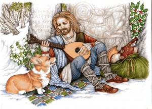
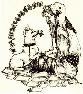
I guess i’d better give a little story synopsis, huh? Okay – the book opens with a wind storm raging outside a little girl’s bedroom. The howling wind wakes Sophia (our heroine) and her mother suggests they count animals until she can fall back to sleep. In her dreams, however, the animals get all swooshed up in the wind storm, spinning faster and faster until “the wind blows them right out of their coats” and they are left standing in Sophia’s room shivering “in their bare skin“.
Sounds cute, doesn’t it? The operative word here being sounds. Now picture the reality… take your time i’ll wait. Do images of naked mole rats, plucked chickens, Chinese crested dogs, and those weird cats without hair come to mind? Do any of those things actually look cute? (well, obviously to some folks they do, and no offense to naked mole rat lovers and Chinese crested dog and hairless cat fanciers intended). Heck, even sheared sheep and shaved alpacas look a little… peculiar (and not necessarily in a fun way, tho i suppose the argument a could be made that they are at least funny looking). Anyway, now try and figure out how to draw that – for a children’s book – without creeping the reader out. Not to mention there is a whole other problem you probably have never thought of (having little opportunity to imagine naked fauna) – without distinctive markings, color patterns, fur, hair, or feathers a number of animals don’t really look like much. Or at the very least they all look surprisingly alike. Think about it: line up a jaguar, a leopard and a tiger and strip off all of their fur, now you have three large cats that could all be pumas or panthers or lions (sans mane). The point is – without fur, feathers, distinctive coloration, markings or patterns you don’t have a lot to work with by way of distinguishing one animal from another, and all birds simply wind up looking like varying sizes of frozen poultry (and i don’t care who you are – plucked birds have got to be the ugliest things on the planet. Well… besides hag fish).
The whole story is about Sophia attempting to clothe all these naked animals, first with outfits from her own closet and then later by fashioning their real coverings, or a reasonable facsimile, (thus the Fur and Feathers of the title) from things found in her grandmothers sewing box. It’s all really very clever how she does it but this is where words have a bit of an edge over the visual arts in that words don’t have to show you how it’s done or what these poor exposed creatures look like in the interim. That task fell to me. So the first order of business was figuring out how to convey nude creatures in a fun, uncreepy way, and also have the young child reader/listener be able to figure out what the different animals were without benefit of their normal distinguishing characteristic externals.
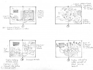
I was pretty safe for the first two pages because the opening illustration shows Sophia and her mom in Sophia’s room – so there were no animals, naked or otherwise, to contend with. And the second page was the wind/animal/dream vortex so i could just show bits and pieces of various animals all still mostly covered in their regular fur/feathers or hidden by storm debris. It was after page 2 that the difficulty (and the fun challenge i hasten to add) began because that was when all these bare animals showed up and Sophia’s adventures started in earnest, beginning with pulling all her clothes out to cover them. It was the clothes that finally solved my problem. By putting the animals in various human outfits i eliminated the need to show any of them completely naked.
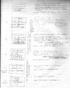
The Featured Naked Animals In Children's Clothes
Eight specific animals are featured in the story, and these guys would be in “costume” until covered by their new “natural” Sophia-made dressing of fur or feathers or scales or slime thus no longer posing an esthetic problem. For me. I’ll happily concede i probably spent way more time worry about that detail then was absolutely necessary – but such is my process. Obsessive is another description that comes to mind. As does Compulsive. Or Anal. I’ll cop to them all. And my overly-analytical micro-management concerns about making naked animals look appealing (and identifiable) did not completely end with the addition of clothing. I was faced with one more dilemma – what to do about the Polar Bear?
A polar bear is the very first animal Sophia “fixes” (for lack of a better word) and here is where the realistic side of my art style came into play, as well as 11 years working for SeaWorld – one major project being a back stage mural of a polar bear habitat. My SeaWorld stuff, by it’s nature, has to be more realistic and i take a lot of pride in researching whatever i’m called upon to paint, sketch or draw so that it is correct. And one of the biggest things i learned during my polar bear mural experience is – Polar Bears have black skin! (NOTE: another little FYI tid-bit: their fur is technically clear. Think of it like a sheet of plastic wrap – it’s transparent until you ball it up, then it become opaque, and looks white. That’s how P Bear fur works – the fur is actually transparent so the Sun’s rays can penetrate to the black skin beneath – thus keeping the bear warm. Pretty cool, huh? No pun intended).
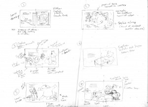
So now i was faced with a naked polar bear that would technically be black with all it’s fur removed, so that it now looks like a black bear (at least as far as a children’s illustration is concerned. Obviously, in real life, a polar bear looks nothing like a black bear – they have completely different body shapes), which i feared would confuse both a child and an adult reader. Of course nothing in the manuscript said i had to show the polar bear prior to receiving his new coat (and why Sophia’s grandmother has fur in her sewing basket will be discussed in a future installment) but i like the continuity of linking story elements together, and giving little visual hints and clues of what is to come in the illustrations, so i really felt it was important to show the p bear going thru the entire make-over process. Again it was the clothing that came to my rescue and if you look at the upper right corner of the thumbnail sketch above (or the pencil rough below) you’ll see how i solved the problem. I put the p bear in a hoodie and then simply covered as much of him up as i could.
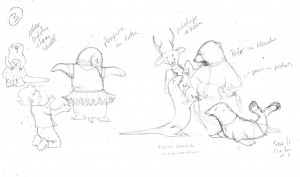
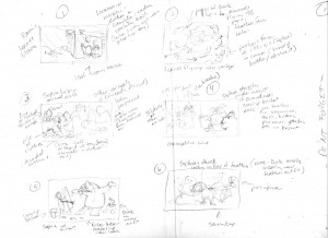
Rough Thumbnail for Page 3 - Sophia Dressing the Animals
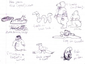
With that problem solved, and an idea of how i would handle the other featured animals as they each appeared in the story, i was able to start brainstorming the actual rough sketches. Page 3 is where Sophia dresses the animals in her clothes and i wanted to show a variety of animals in a number of very silly and inappropriate (for an animal anyway) outfits. The polar bear was the only “featured” animal i wanted on the page so i had to come up with some new ones. Which, as i explained earlier, isn’t as simple as it sounds because these animals had to be easy to identify without their usual markings (when done in color they’d all be grey or pink after all, or black in the p bear’s case) as well as partially covered up with clothing. A sea lion, deer (later changed to a big horn sheep), komodo dragon (because there is a display of them near-by at the St. Augustine Alligator Farm), and penguin fit the bill perfectly. And then i thought of the sea otter…
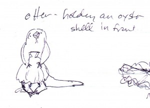
Naked Sea Otter w/ Clam Shell
… my personal favorite i must admit. Proving, i suppose, that naked animals really CAN be cute after all!
Now it was time to start doing the rough sketches (aka: To be continued…..).